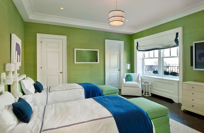
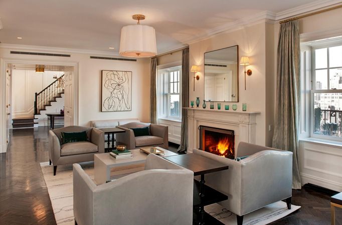
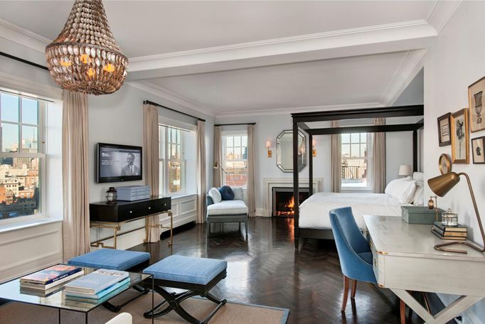
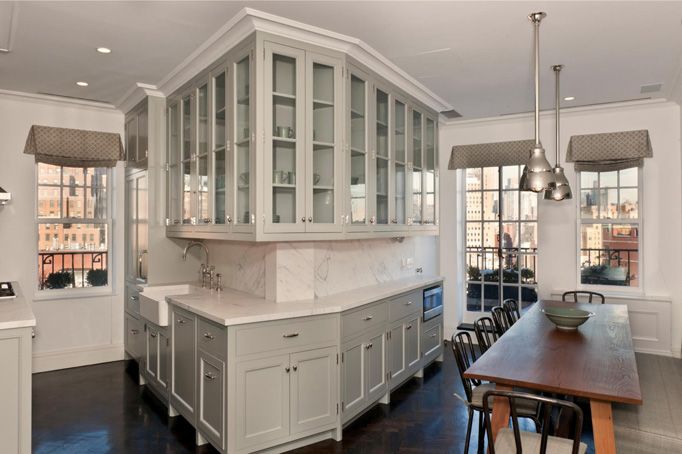
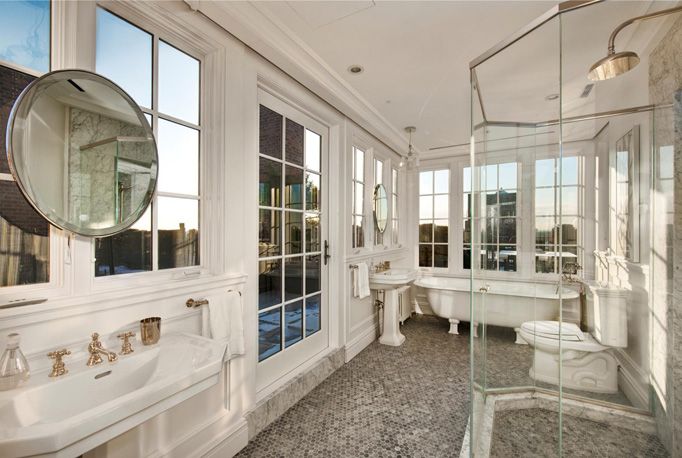
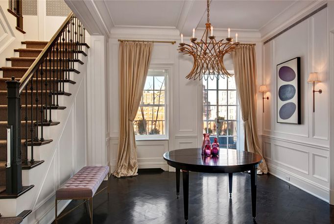
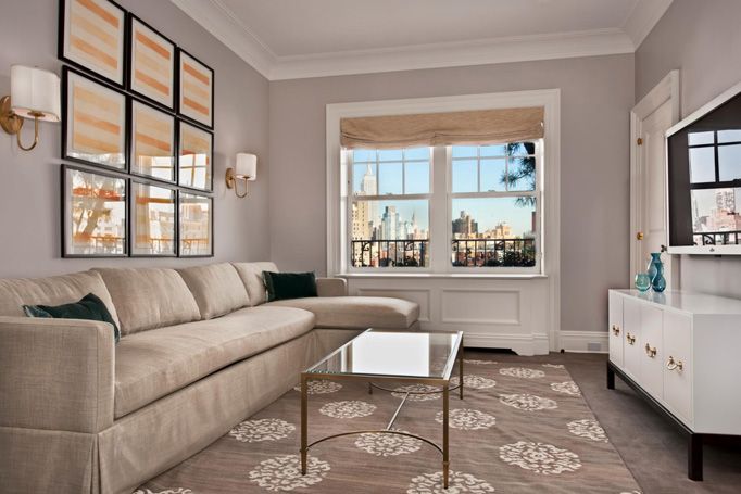
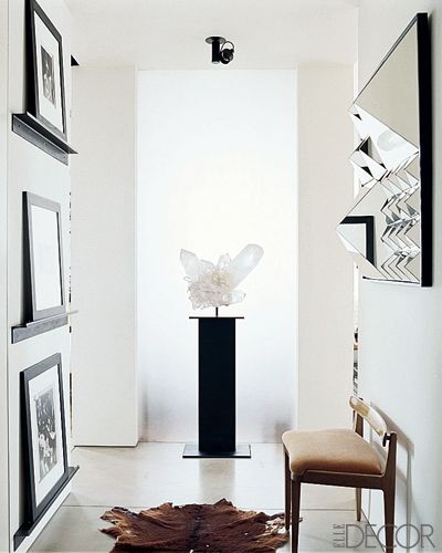
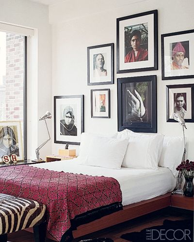
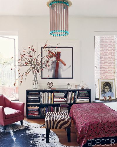
I thought Jennifer Aniston was buying the above place but apparently not because word on the street is that she just bought the below for half the price (I find out all of the BIG news on my Yahoo homepage). Why would one care anyway...well because the top place is one of my favorite spaces designed by Lauren Stern Design group. If you are not familiar with their work then go here to become acquainted with it. You will likey.



15 comments:
Love these images! The entry way is so grand and beautiful and that kitchen is awesome, too!
these photos are great inspiration.... that kitchen makes me melt. someday.
ally
So this is the rumored one!Wow, not shabby enough for the price I'm loving this eye-candy. Huh, I wish I wish that was ours, okay I could dream all I want cause the interiors makes me go dreamy and all. Lovely indeed. buy aion accounts
I'm totally being swayed by the photography here and loving space #2.
I'm sure space #1 is great too, but those wide angles are messing with my head!
Totally lovely house! The chandelier really is marvelous! And I would say nicely designed interior! Great post, check out also 3D Rendering
Okay, so those first few pictures literally took my breath away. Wow...incredible floor plans and killer decor {oh, and genius color combo...who would have thought that blue and green could look so bright and fresh paired together in that bedroom?!?!?}
xx Cat brideblu
Wow! im seriously speechless. this house is fabulous. so fancy and i love all rooms no exceptions. thanks for sharing :)
www.madebygirl.com
madebygirl.blogspot.com
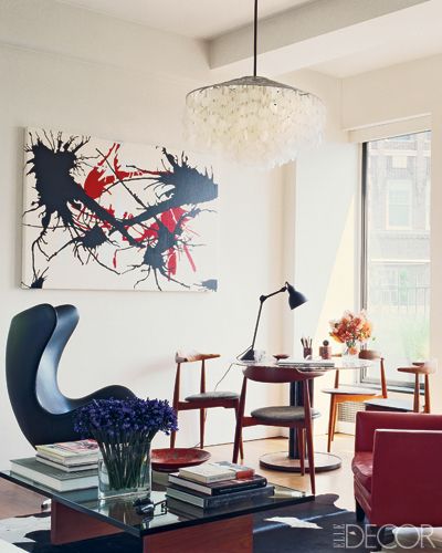
the "below place" is sally hershberger's place...or was.
the first place is too stilted for me.
boring.
i love YOU though.
Gorgeous!!
www.thisfarmfamilyslife.blogspot.com
love the post ;)
http://santiroyalhome.blogspot.com/
Oh my but the first place is gorgeous. The bath. The kitchen. The bedroom. So restful and bright.
LOVe the cabinets in the kitchen...and adore the table fit in there too! we have a table in the middle of our kitchen right now and the leaves flip up on both sides...LOVE having it there!
yes, the first one is AMAZING! I cannot tell much about the interior architecture on the second.
This was Sally Hershberger's place right? Loved it in Elle Decor, esp. the chandelier in the kitchen over the bar counter!
Pretty sure I'd be happy in either space! They're both sooooooo pretty! I'm dying over that bathroom in the first house.
turn up the rad blog
turn up the rad creative
Post a Comment